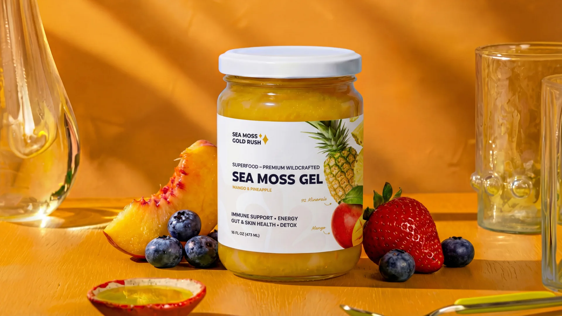
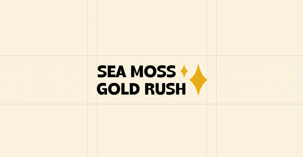
Branding & Packaging – Sea Moss Gold Rush


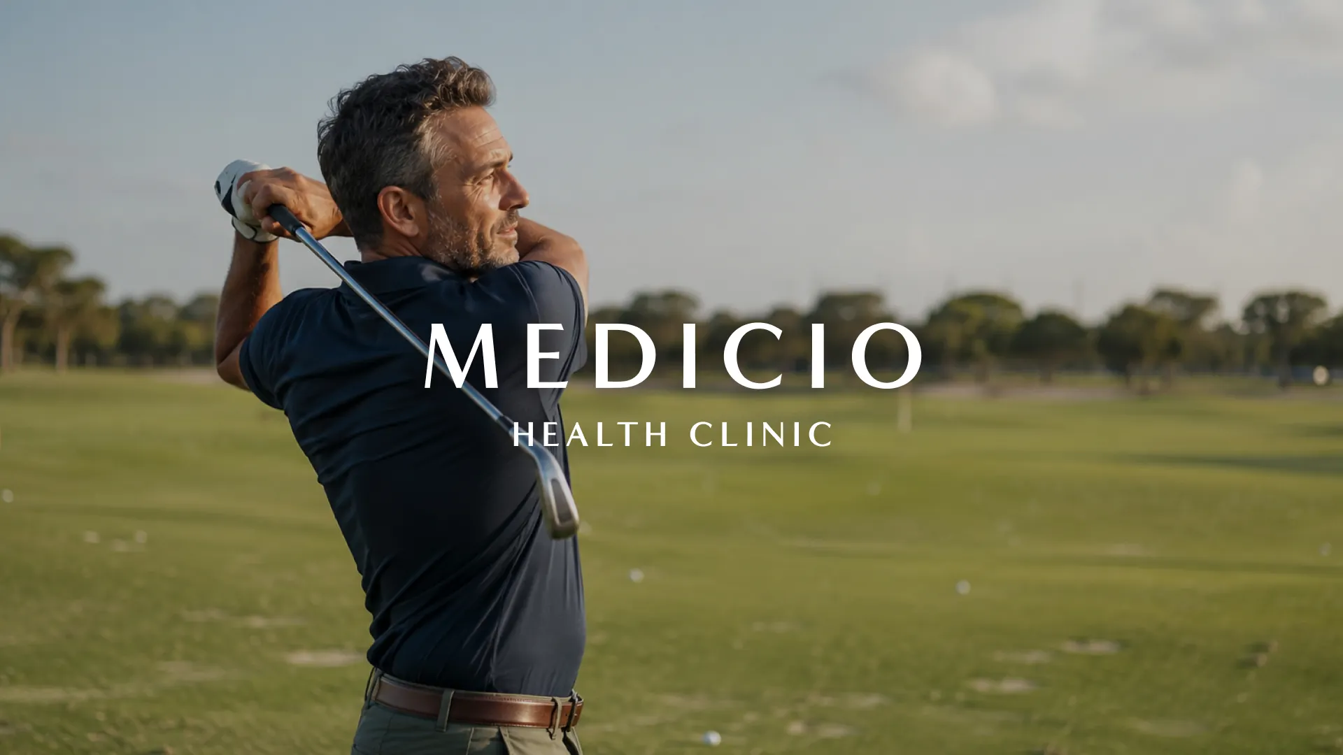
Brand Strategy, Brand Identity, Website Design & Development, Copywriting, Art Direction & Photography, Email Marketing, Advertising, Print & Editorial Design
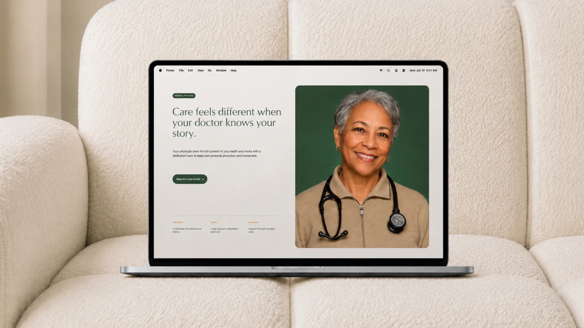
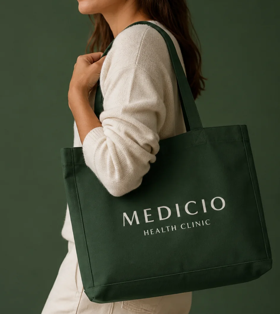
Medicio Health Clinic is a private healthcare clinic in Toronto built around a more proactive approach to health—for individuals, professionals and entire families.
Rather than waiting for something to go wrong, Medicio helps its members understand their health, plan ahead and make better decisions over time.
We worked with the clinic from its early stages to create the brand, digital experience and marketing system around that idea.
Medicio was a new company entering a category where trust matters more than novelty.
We didn't want it to look like a startup.
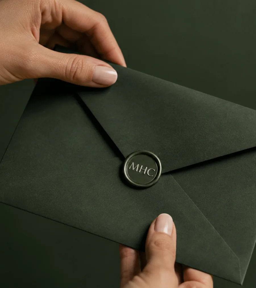
The identity was designed with the restraint and confidence of an established healthcare institution, while still feeling contemporary enough for a new generation of private healthcare.
Classic typography, considered layouts, a restrained visual language and carefully art-directed imagery gave the brand a sense of permanence without making it feel traditional or dated.
The result is intentionally quiet.
It doesn't need to shout to feel valuable.
The positioning started with a broader idea.
People don't really want more appointments, tests or treatments. They want to live longer, stay capable, feel good and know that the people they care about are looked after too.
That shifted the communication away from simply selling access to a private clinic.
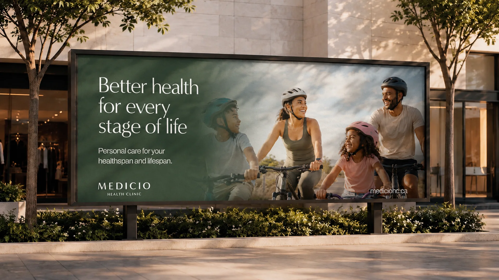
Instead, we built the brand around healthspan as well as lifespan—presenting Medicio as an ongoing partner in managing your health rather than somewhere you visit only when something is wrong.
That philosophy also shaped who we showed.
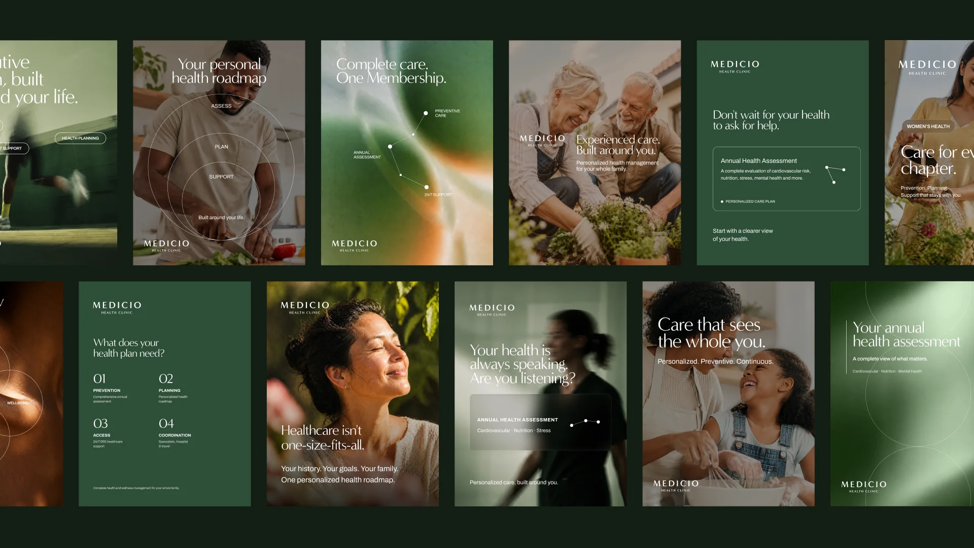
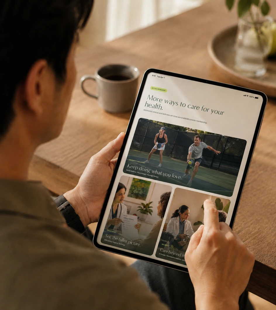
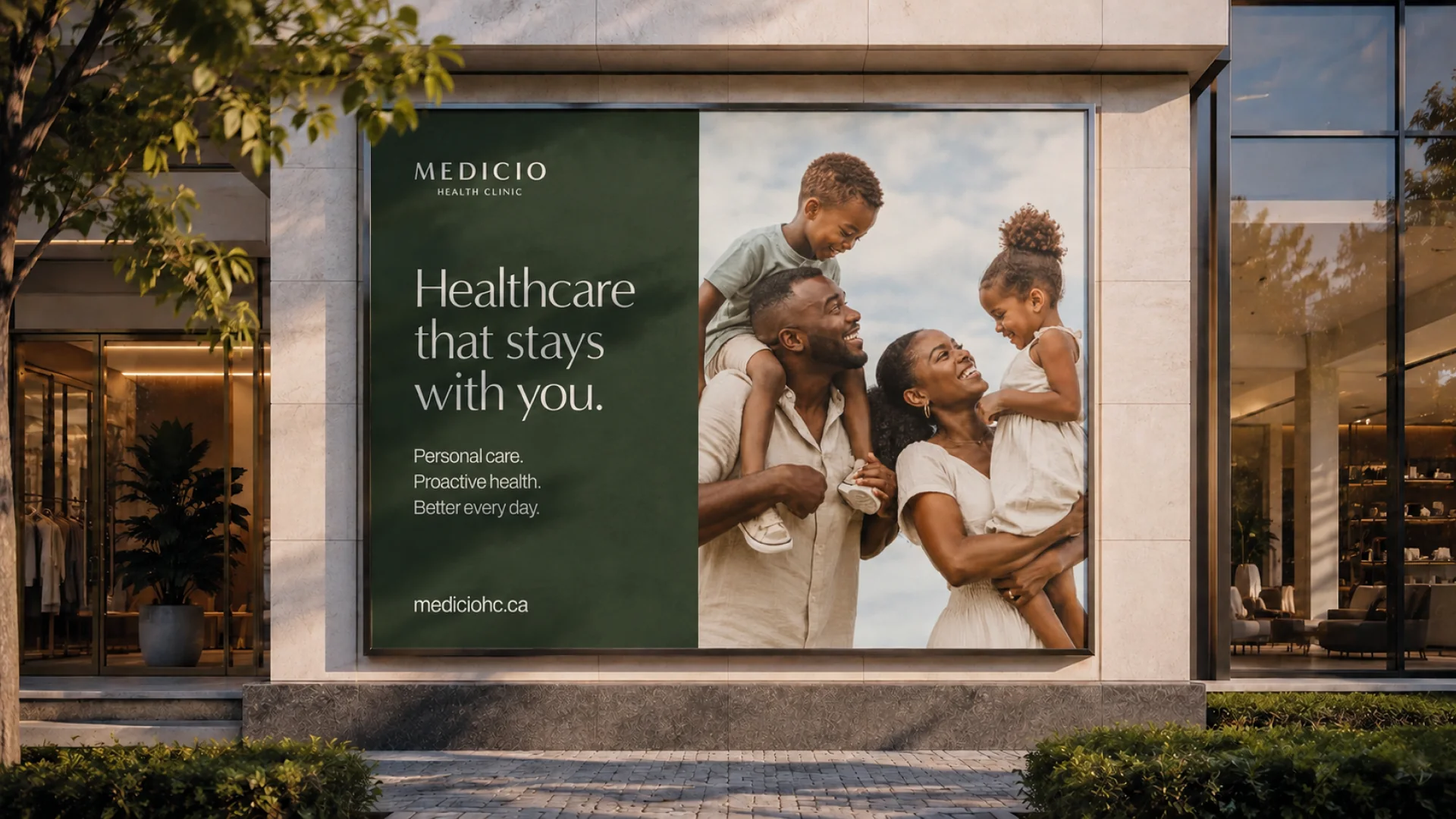
Rather than filling the brand with conventional clinical imagery, we created a photography direction centered around real life: families, children, professionals, active adults and older generations.
Healthcare became part of the story rather than the entire story.
The images focused on what good health enables—time with family, independence, performance, movement and quality of life.
It gave Medicio a warmer, more human character while maintaining the level of sophistication expected from a premium private clinic.
Medicio offers much more than access to a family doctor.
Its model brings together ongoing health management, annual assessments, preventive planning, mental health support, specialist coordination, travel support, virtual care and 24/7 access to the healthcare team.
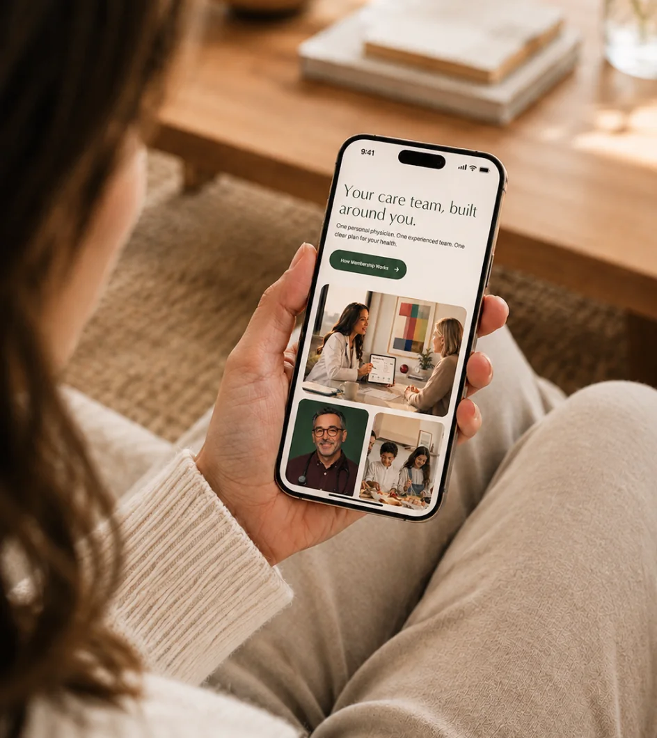
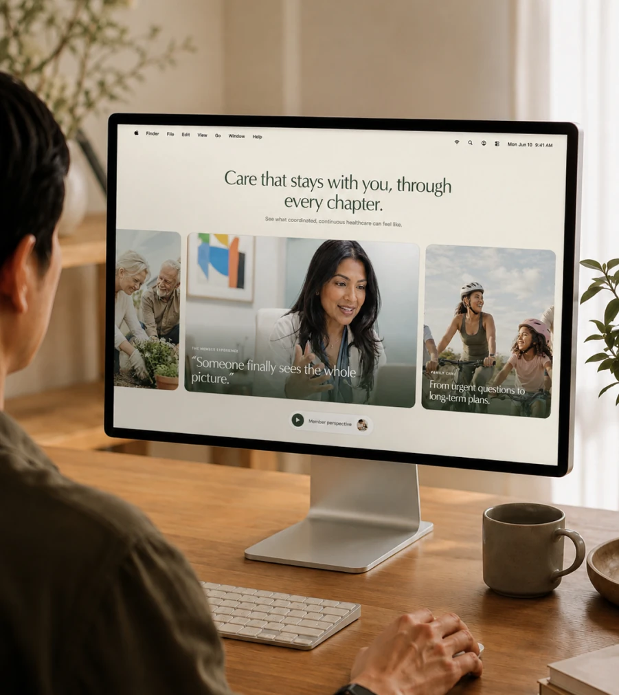
The website had to make that value immediately understandable.
We developed the structure and copy around the questions a prospective member actually needs answered: what Medicio does differently, what membership gives them, how their health is managed and why that matters over the long term.
The goal wasn't to list more services.
It was to make the value of having someone continuously looking after your health—and your family's health—clear.
The same level of restraint carried through every part of the brand.
Photography, typography, colour, layout and messaging were designed for an established Toronto audience accustomed to quality but unlikely to respond to loud luxury cues.
Premium didn't mean making everything look expensive.
It meant making everything feel considered.
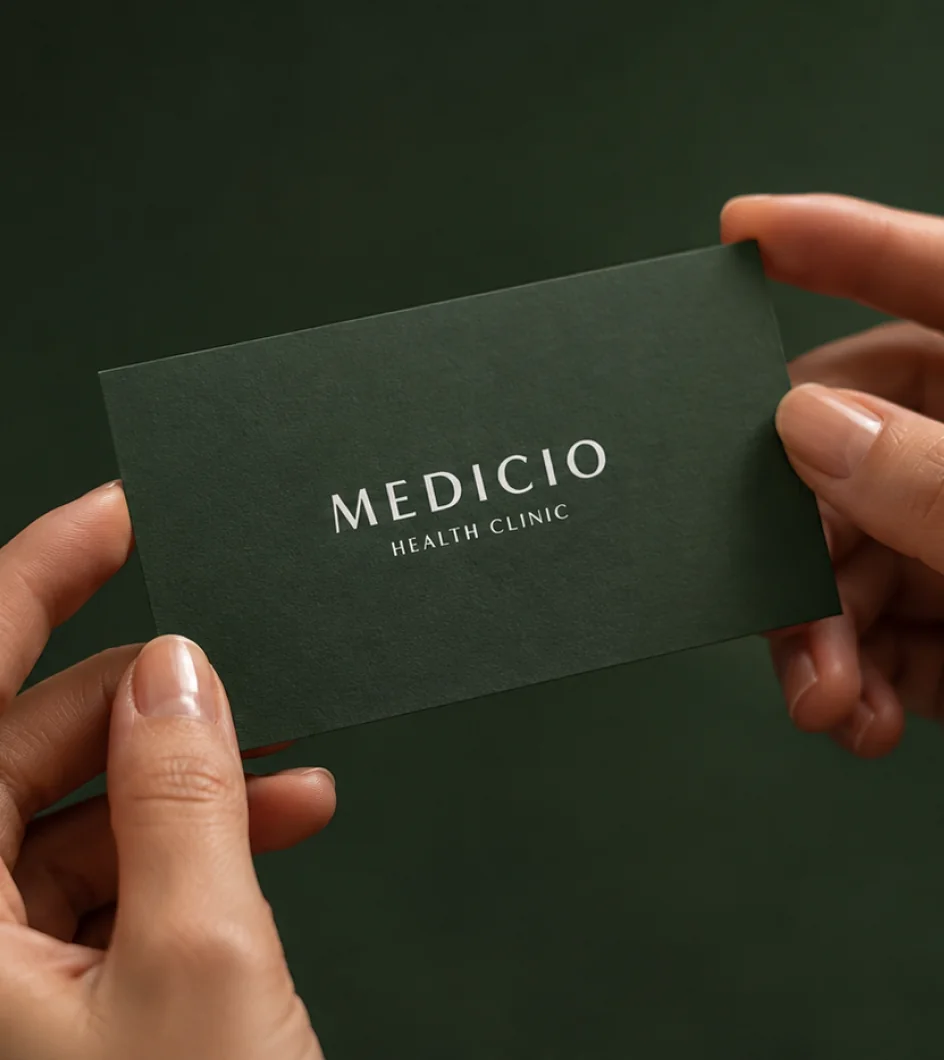
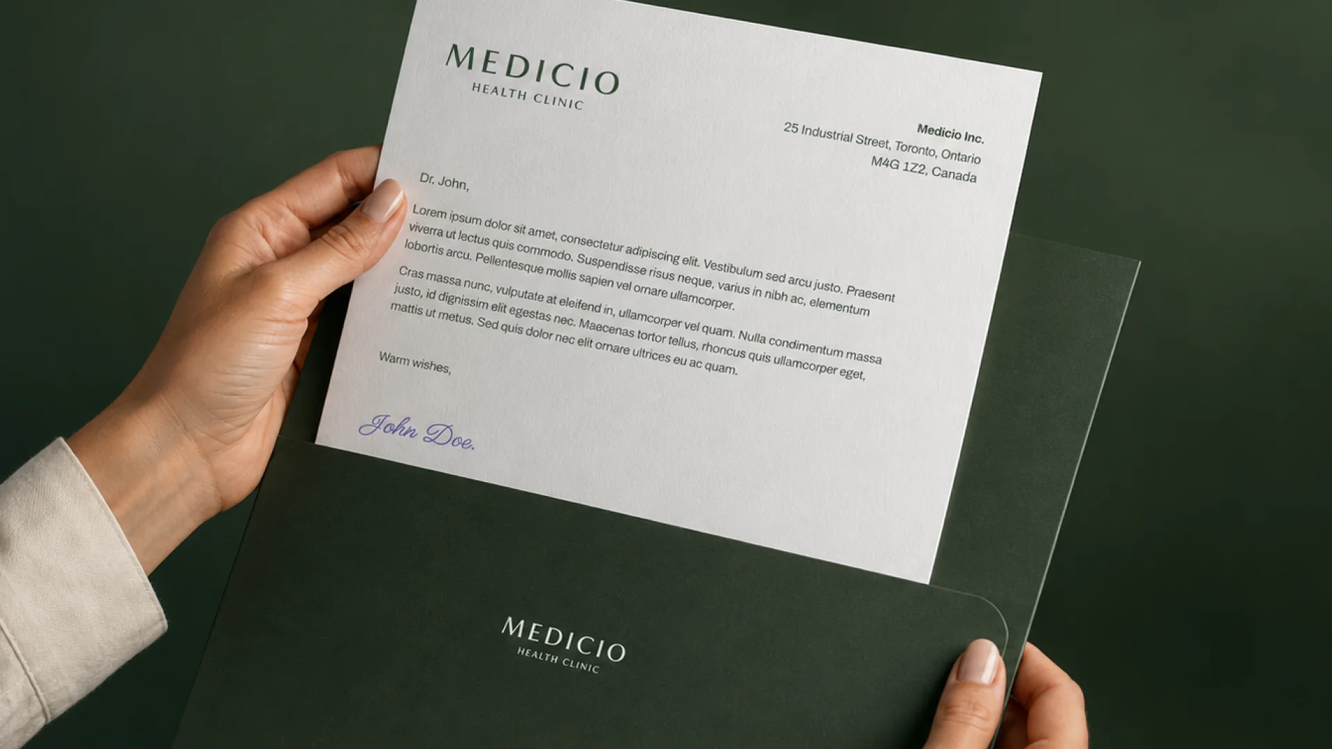
That distinction shaped everything from the website and photography to a simple business card or a full-page magazine advertisement.
Over time, the identity expanded into a much broader communication system.
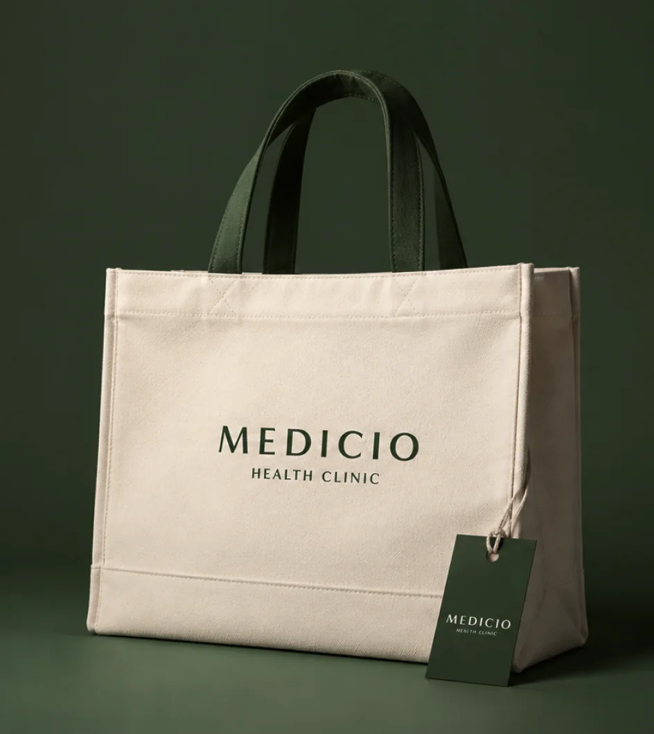
We created brochures, business cards, stationery, documents, magazine advertising, email marketing, digital materials and ongoing campaign creative alongside the website and core brand.
Each application uses the same visual principles, allowing new materials to be created without having to reinterpret the brand every time.
What might be a website one week and a patient document the next still feels unmistakably Medicio.
Our role didn't end when the brand and website launched.
For several years, we have continued working with Medicio as its marketing partner—supporting the clinic whenever something new needs to be communicated, designed, written or launched.
That continuity matters.
Instead of moving between disconnected vendors, the clinic has a team that already understands the business, the audience, the visual language and the thinking behind the brand.
The result is something difficult to create through individual projects:
a brand that becomes more consistent as the company grows, not less.



Marketing Strategy, Visual System, Art Direction, Website Design, Copywriting, Paid Media, Campaign Creative, Marketing Design
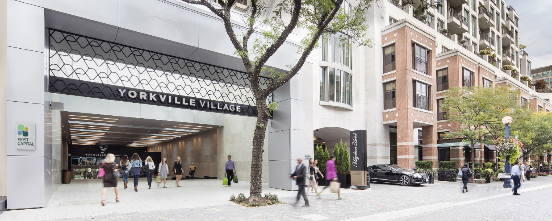
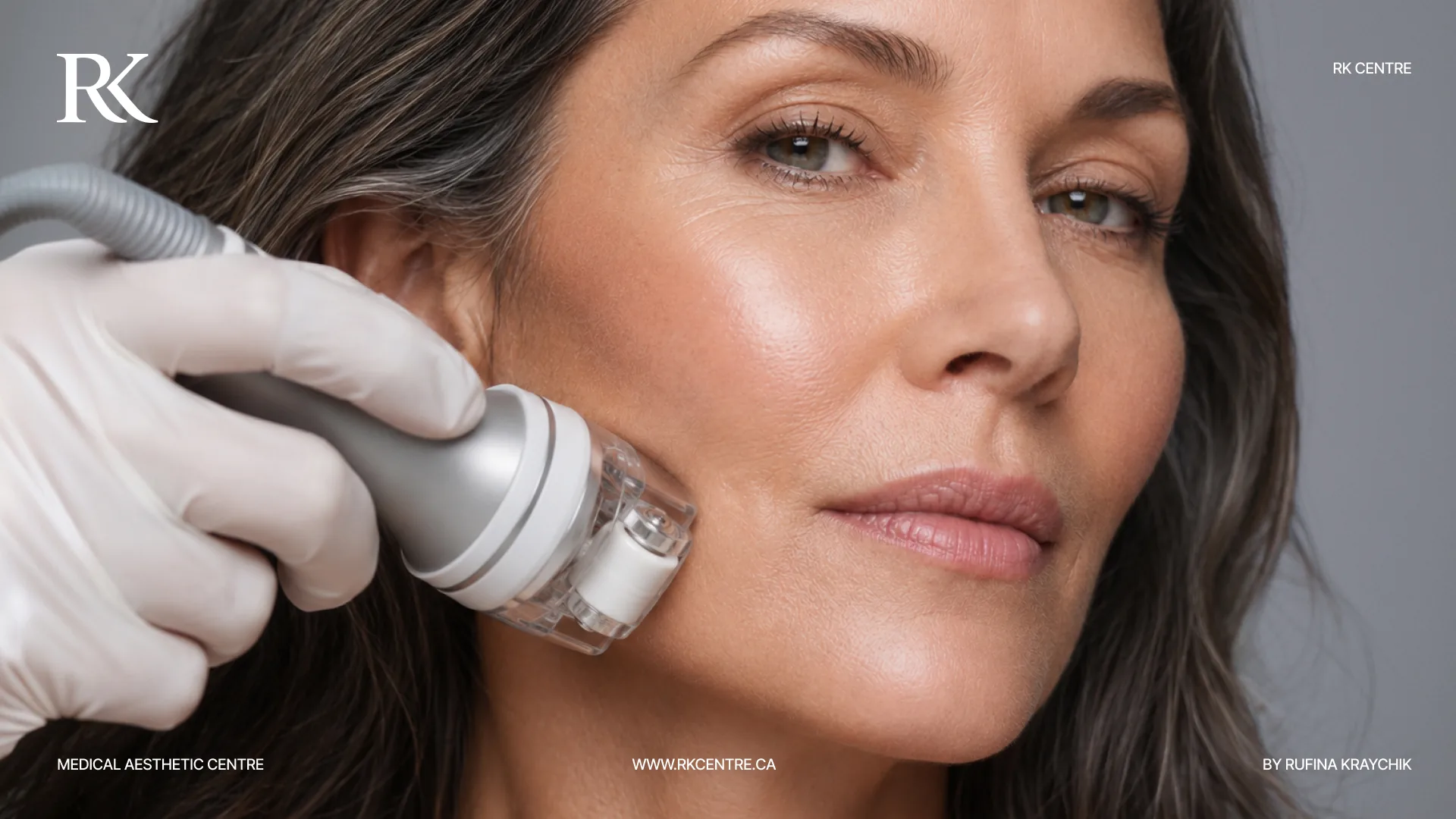
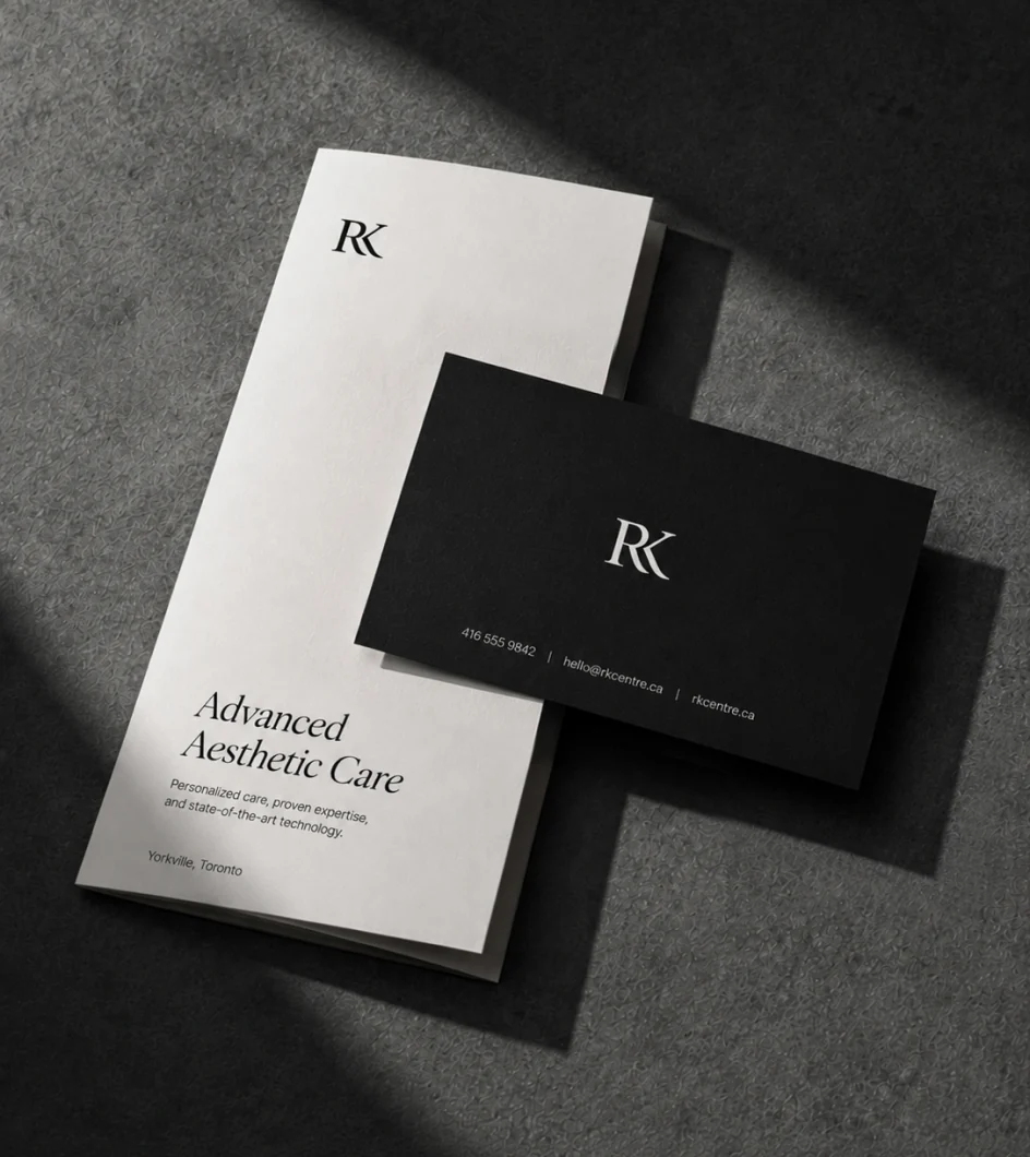
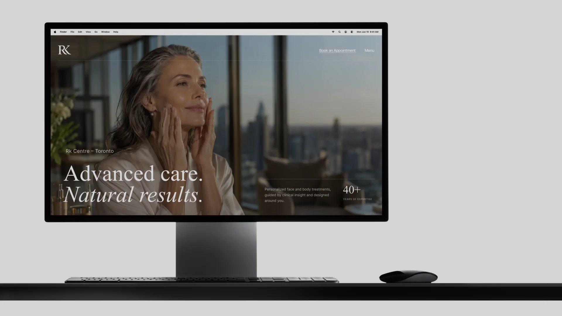
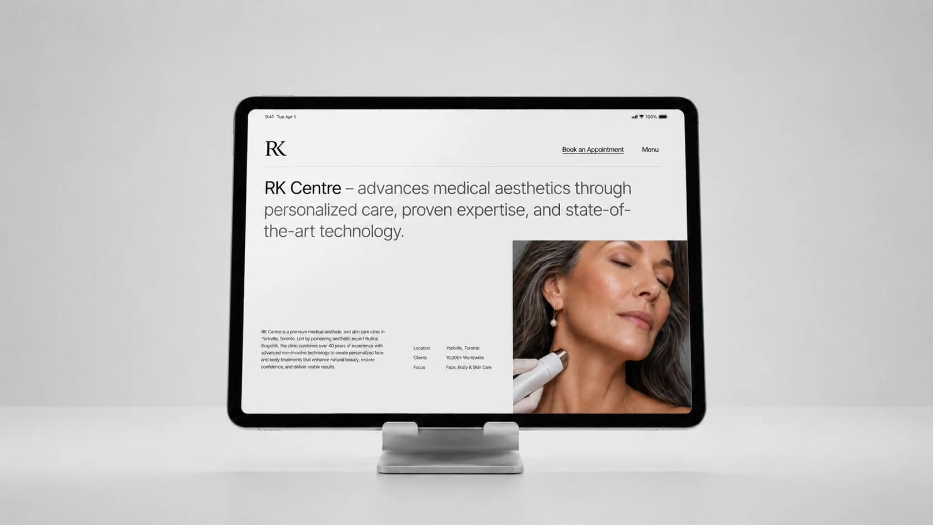
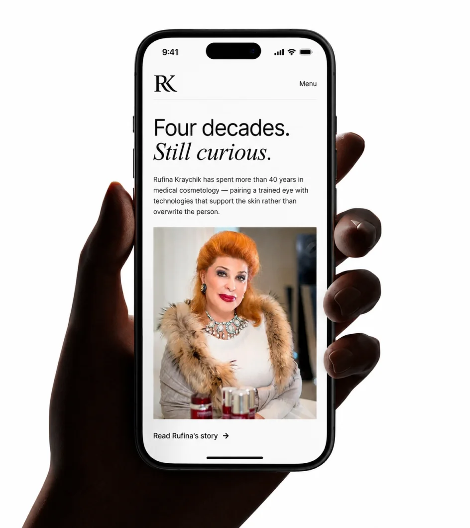
RK Medical Aesthetic Centre is a premium non-invasive aesthetic clinic in Toronto's Yorkville Village. Led by aesthetic expert Rufina Kraychik, the clinic has more than 40 years of experience and has built a clientele that includes executives, celebrities and other highly discerning clients.
The reputation was already there. The marketing needed to catch up.
RK Centre moved quickly.
New treatments, new promotions and new ideas were constantly entering the business. But without a strong system behind them, each new piece of marketing began to look and feel different from the last.
The website, advertising, photography, print materials and day-to-day creative weren't telling one consistent story.
Our job was to bring order without slowing the clinic down.
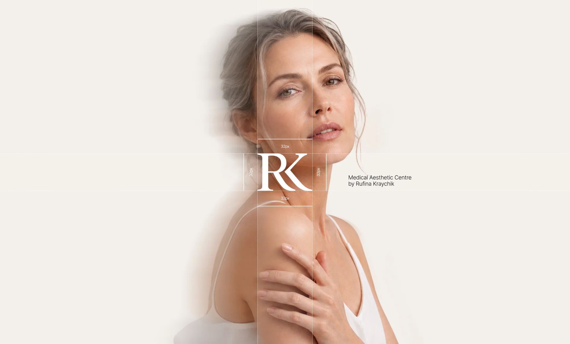
Rather than redesigning every piece independently, we built a visual and communication system that could be reused.
Photography, layouts, typography, graphic elements, messaging, advertising and digital experiences were designed to work together. We created reusable assets and organized the underlying files so new campaigns and materials could be produced quickly without reinventing the brand every time.
Consistency became easier to maintain—even when the business was moving fast.
Most aesthetic clinics try to appeal to almost everyone.
RK Centre didn't need to.
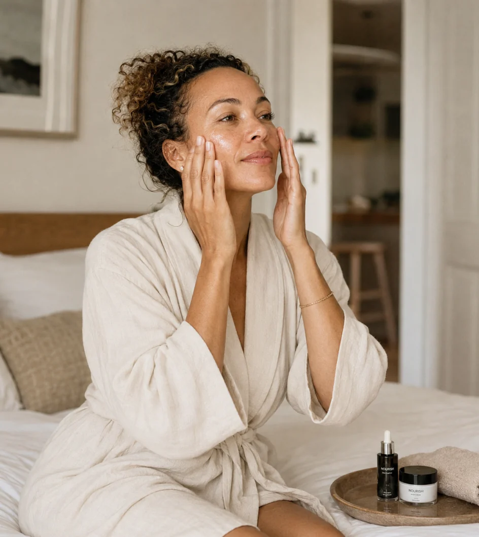
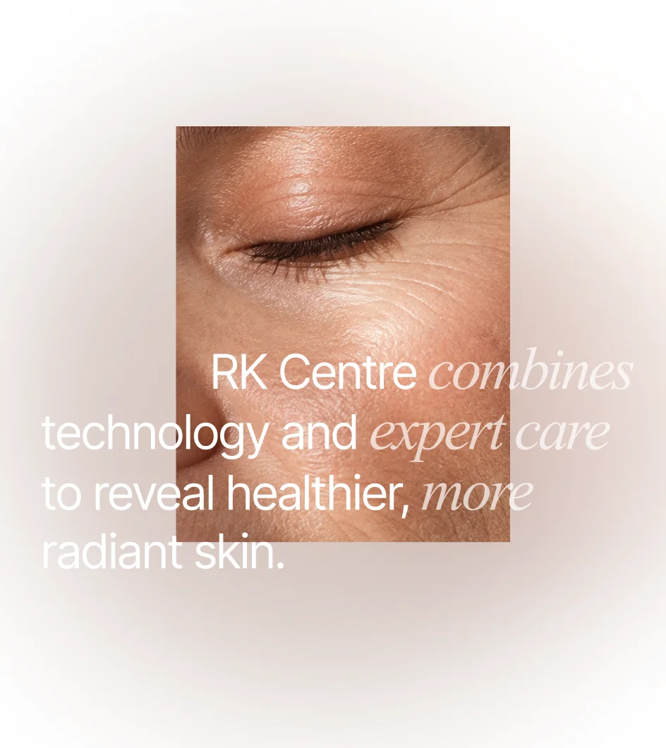
We focused the communication more deliberately around the clinic's core premium audience: established women looking for sophisticated, non-invasive treatments and natural-looking results.
That influenced everything from the photography and art direction to the offers, language, website experience and advertising creative.
The goal wasn't simply to make RK Centre look more premium.
It was to make the right client feel that the clinic was made for her.
Aesthetic medicine comes with another problem: treatments can be difficult to compare and even harder to understand.
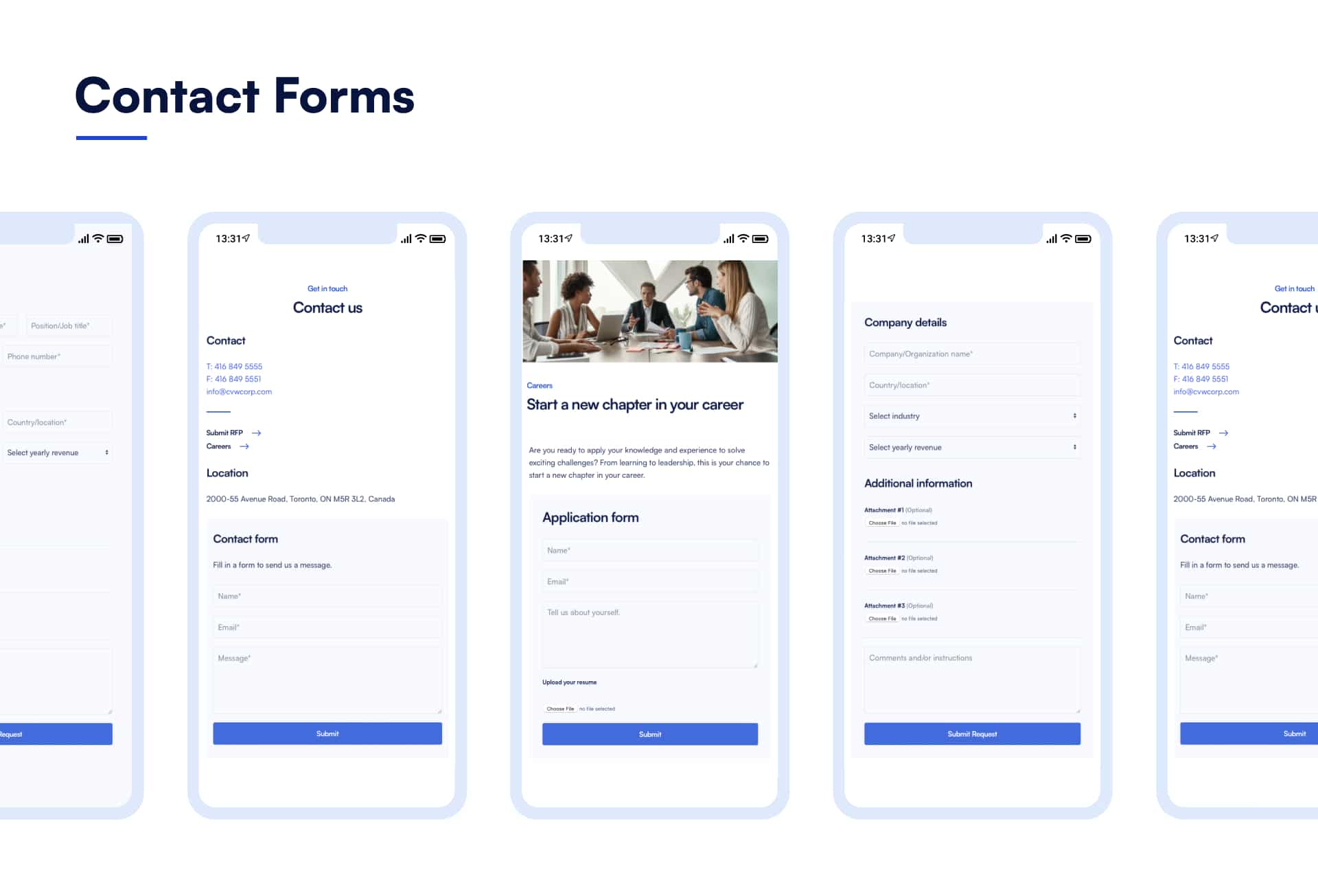
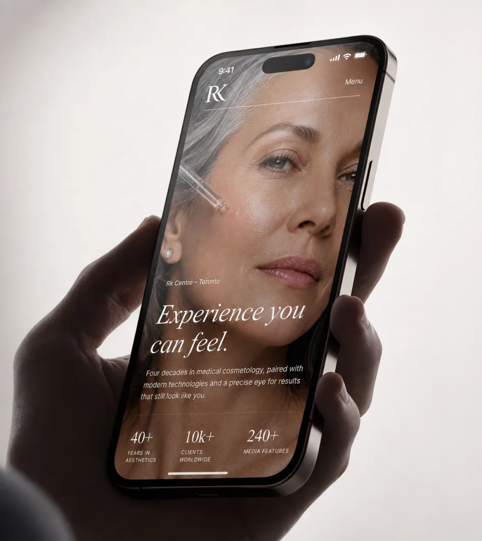
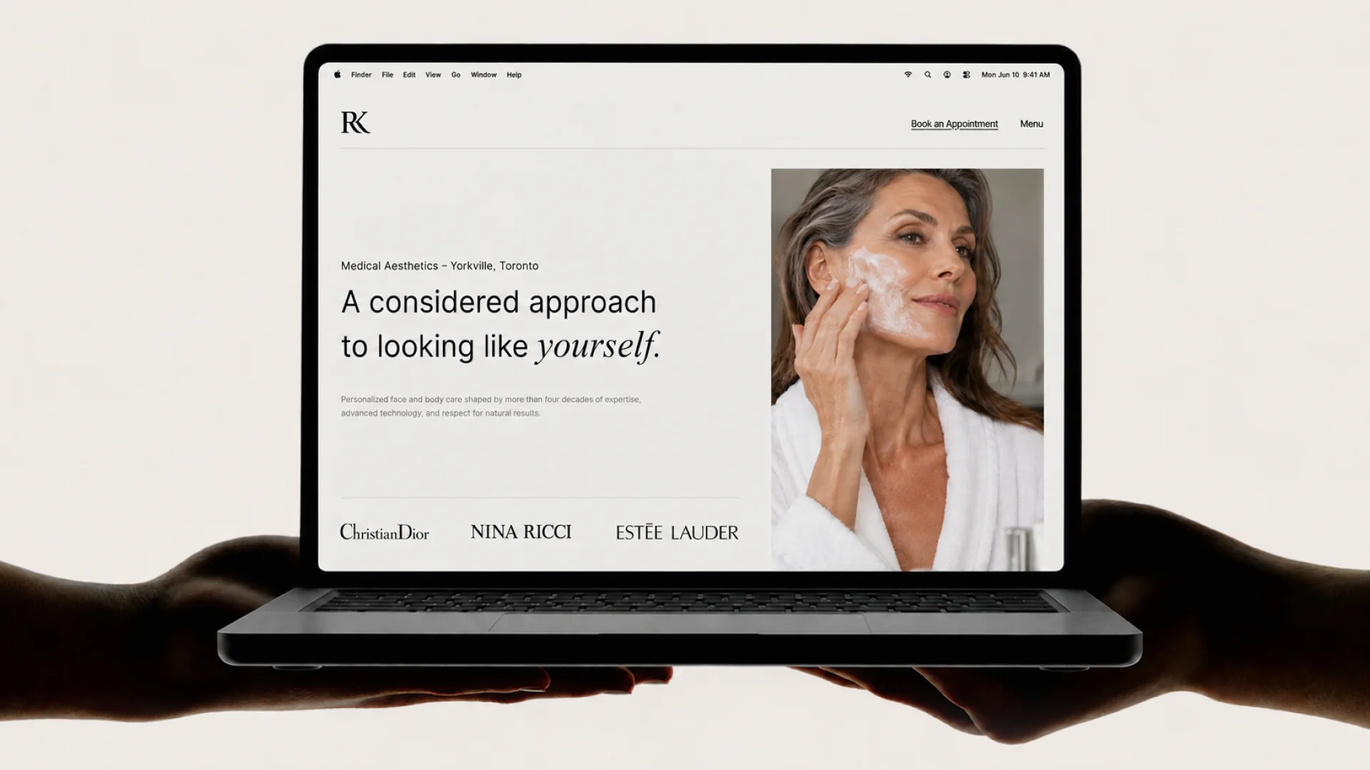
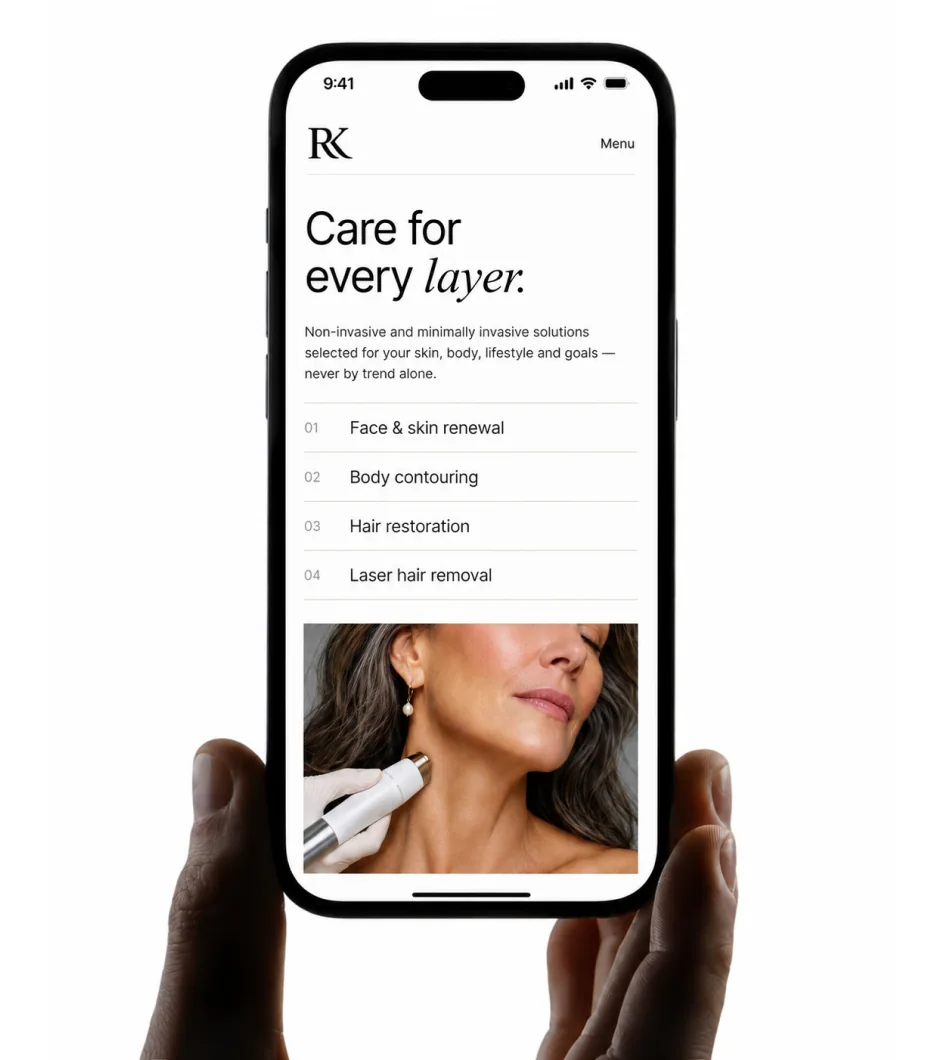
We reorganized the website around what prospective clients actually needed to know—what a treatment does, who it is for, what results to expect and what to do next.
We rewrote and expanded the content, simplified navigation and created a clearer path from discovering a treatment to requesting a consultation.
The clinic repeatedly heard the same thing from clients after launch: the website was clear and easy to understand.
The same thinking carried into advertising.
Instead of treating paid media as separate from the brand, we aligned the offers, audience, campaign creative and landing experiences around what prospective clients actually cared about.
The result was an immediate improvement in efficiency.
Over the years, the system expanded far beyond the website.
We created campaign creative, service photography, digital advertising, print collateral, documents and other day-to-day marketing materials while maintaining the same visual language across them.
But some of the most important work happened behind the scenes.
Assets, templates, photography and production files were organized into a clear working system. When the clinic needed something printed, produced or adapted, the right files were ready. When another team eventually needed to work with the brand, everything could be handed over cleanly without rebuilding years of work from scratch.
Good design should make the next piece easier to create.
What began as a focused digital relationship quickly became something much larger.
Within two months, RK Centre entrusted us with its broader marketing needs. We continued working together for years across digital, creative, advertising and ongoing communication.
The work also became its own source of referrals, with people who encountered the brands and experiences we created approaching us for their own websites and marketing.
The strongest proof wasn't simply how the work looked.
It was how well it worked—for the clinic, for its clients and for the people who had to keep using it.

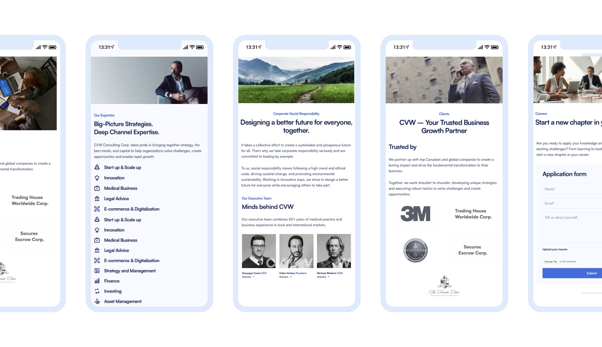
Brand Identity, Website Design & Development, Copywriting, Photography, Digital Design
Canadian Centres for Regenerative Therapy is a Toronto-based clinic focused on regenerative and translational medicine.
The challenge was to create a brand that could communicate medical expertise and scientific credibility without feeling overly clinical, dated or difficult to understand.
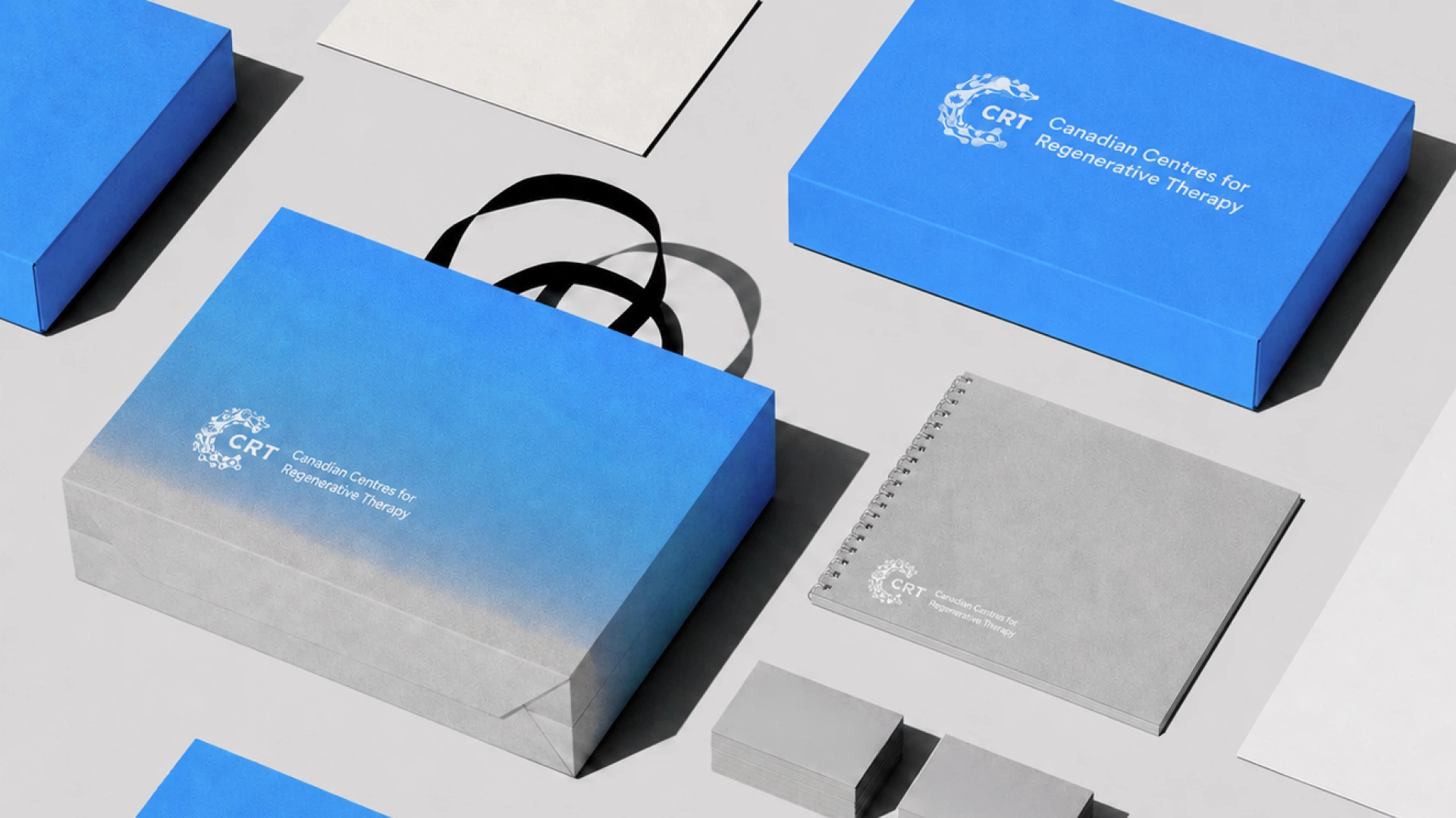
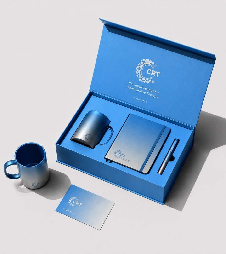
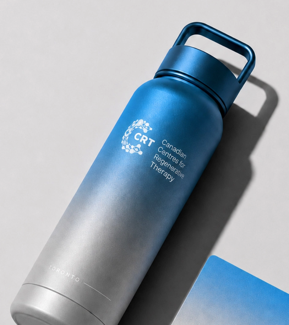
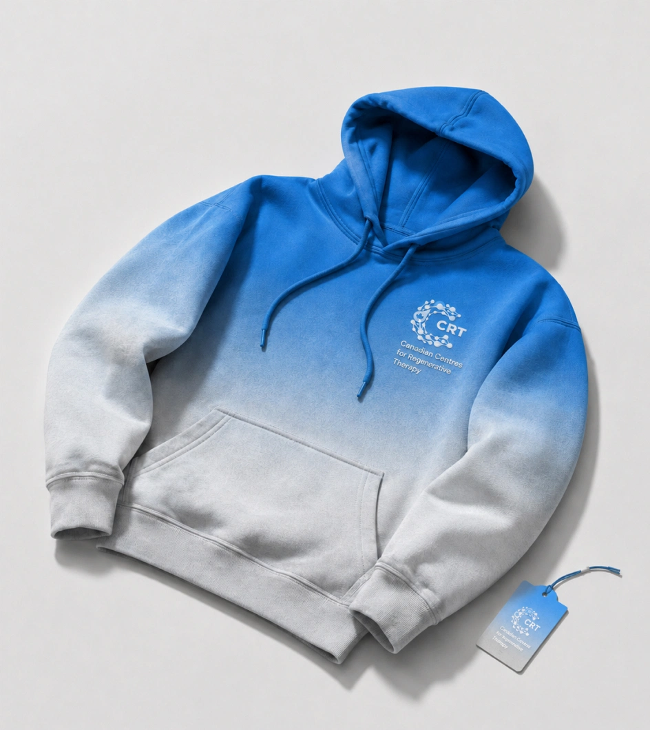
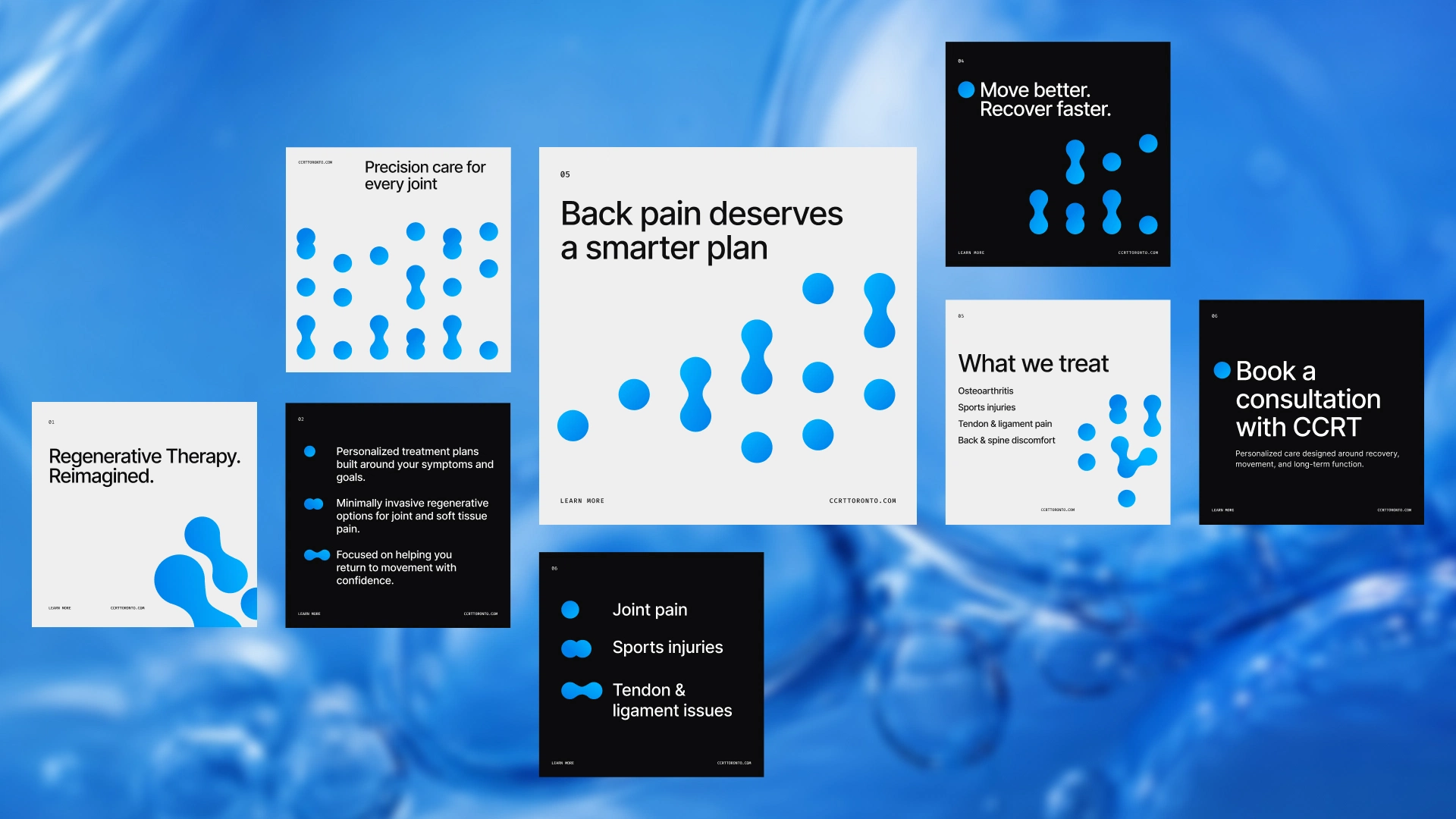
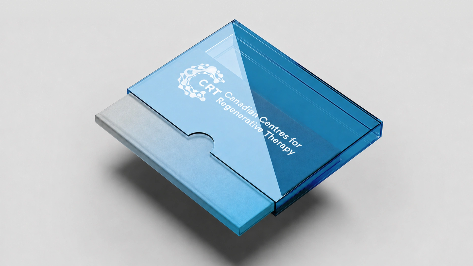
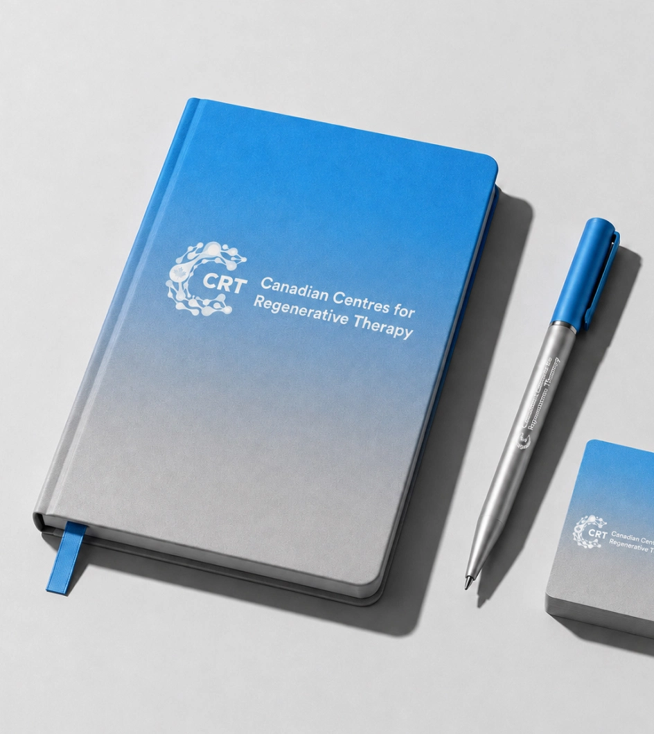
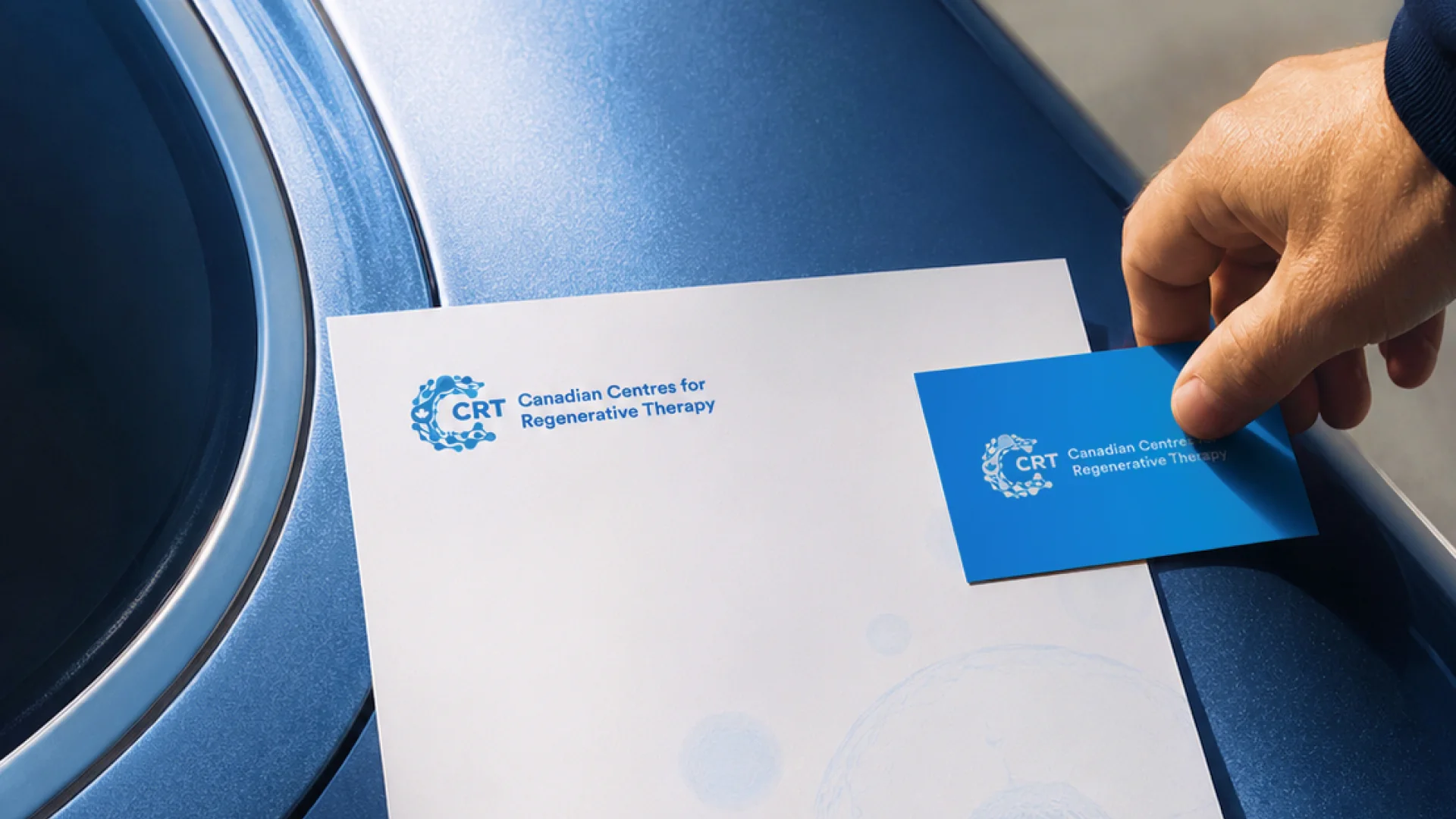
The identity, website, content and original photography were created for CCRT. Some of the additional applications shown here were developed later by Gazizoff to demonstrate how the original identity could extend across a broader range of touchpoints.
We started by creating the visual identity.
The goal was to find the right balance: credible enough for a medical and scientific organization, but modern and approachable enough for patients encountering the clinic for the first time.
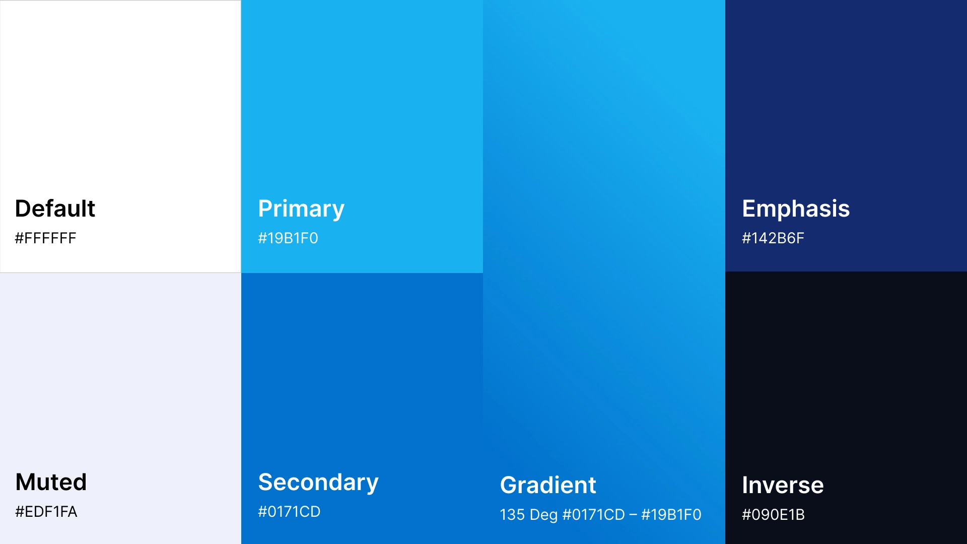
The identity was built around a restrained visual language, strong typography and a clean, contemporary aesthetic designed to give CCRT a distinct presence without relying on short-lived healthcare trends.
The project developed in stages.
After establishing the identity, we extended it into business cards and other essential brand applications before bringing the same visual language into the clinic's website.
This helped turn the logo into something more useful: a consistent foundation that could guide how the clinic looked and communicated across different formats.
The core identity created during that work remains in use years later.
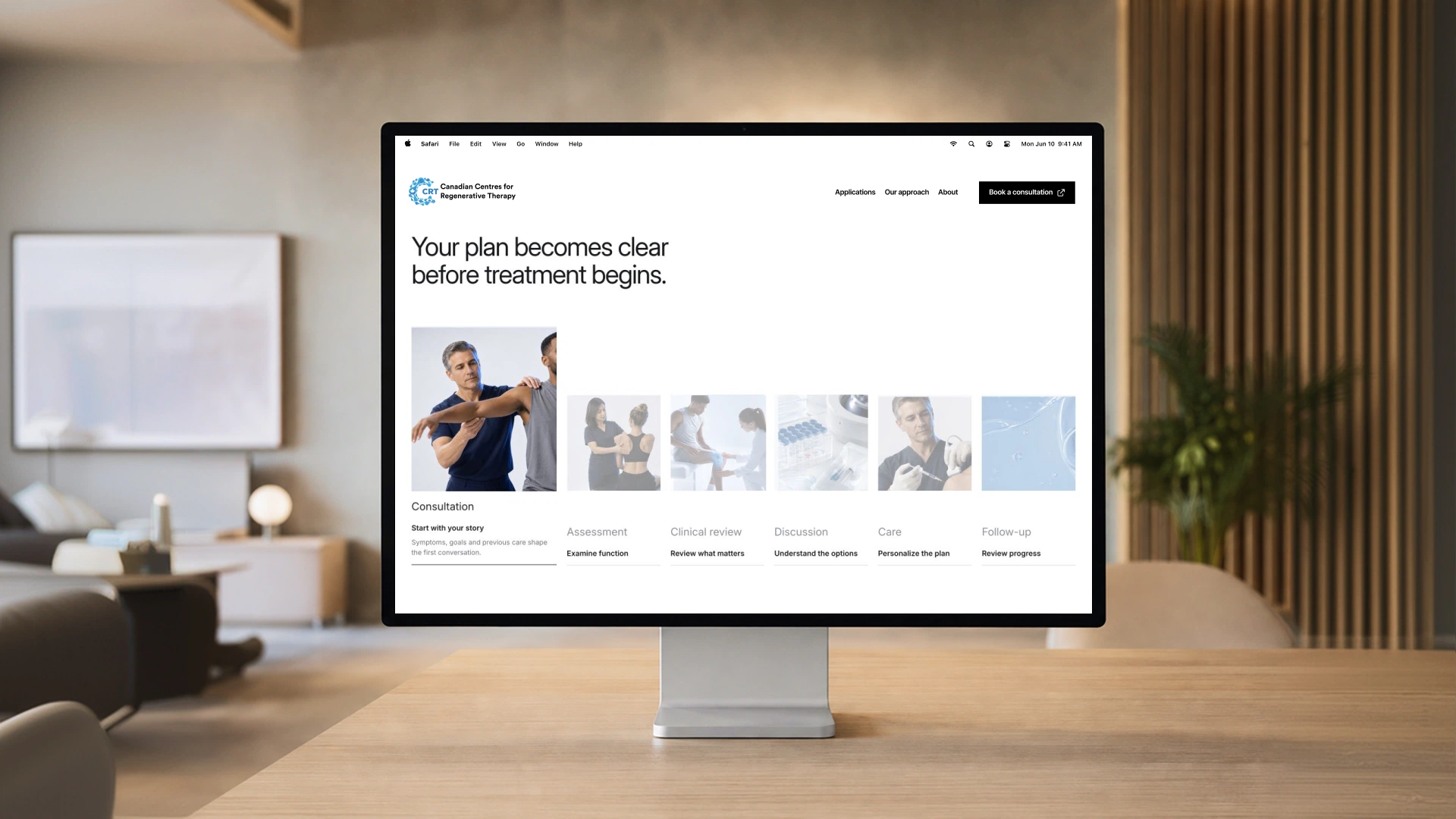
The website wasn't designed simply to list treatments.
We worked on the structure and copy to help prospective patients understand what CCRT does, the expertise behind the clinic and why its approach may be relevant to them.
That meant giving complex services enough context to build confidence without making the experience unnecessarily complicated.
We developed service content, supporting messaging and leadership copy—including the founder's biography—to create a more complete picture of the people, knowledge and experience behind the clinic.
Healthcare is personal, even when the subject matter is highly technical.
Alongside the website and identity work, we photographed the clinic's founder to give the brand a more credible and human presence across its digital communication.
Rather than relying entirely on generic medical imagery, the original photography helped connect the organization to the people actually behind it.
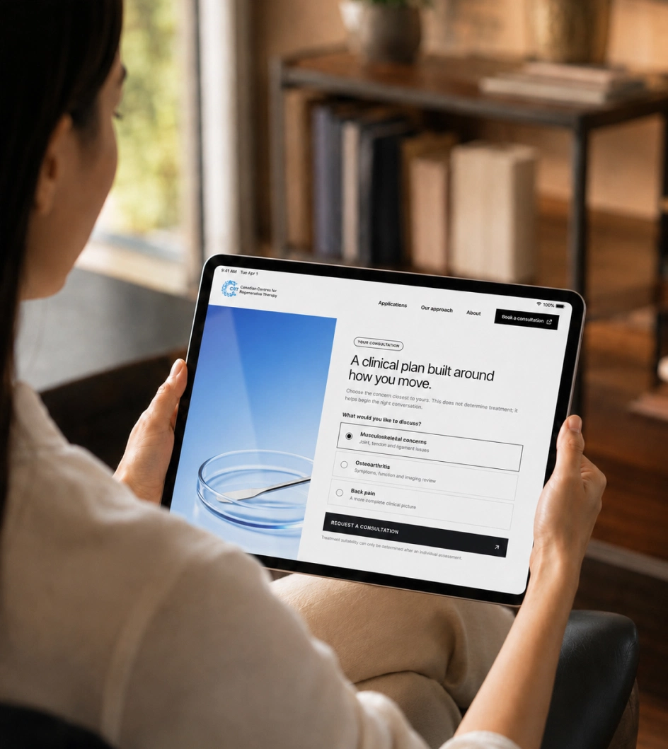
The website brought the identity, content, imagery, typography and interface together into one consistent experience.
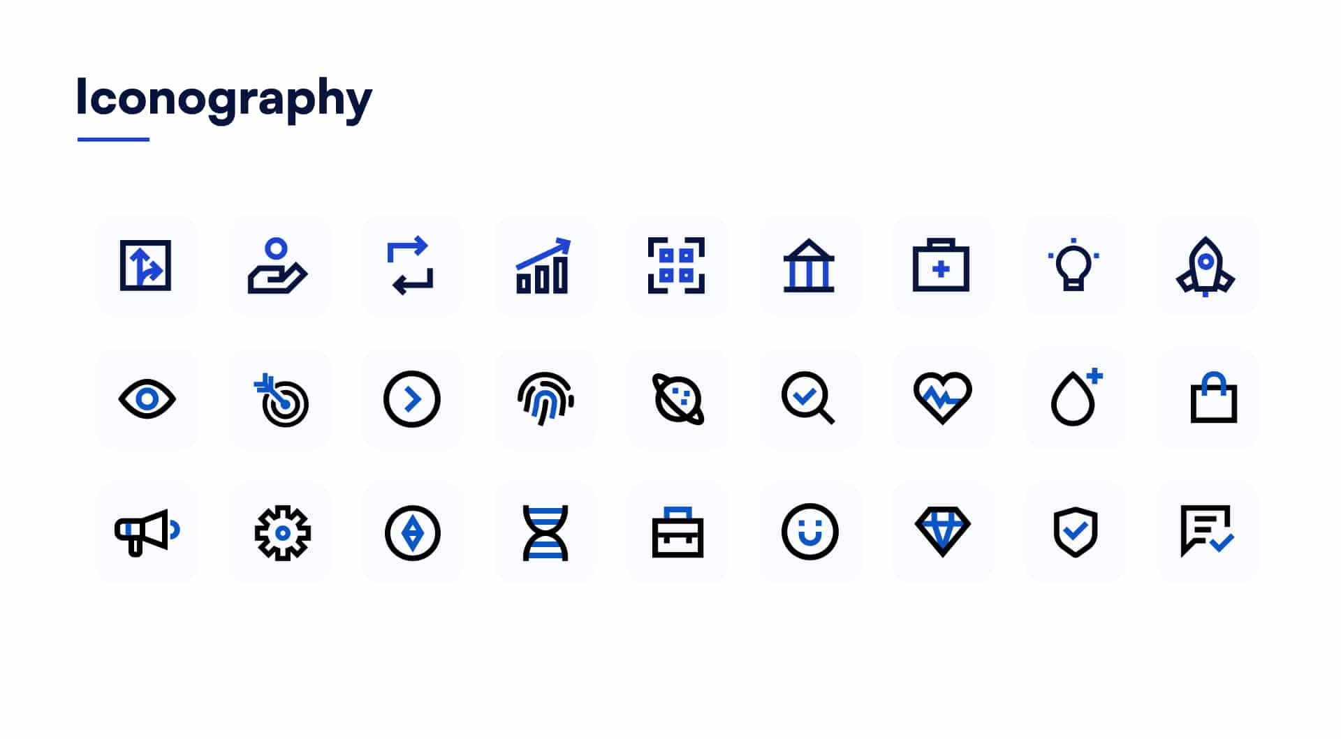
Reusable layouts, iconography and visual patterns gave different services and pages a common language while still allowing the content to change.
The result was a brand that could move naturally from a business card to a detailed medical website without feeling like separate pieces created at different times.
CCRT was one of our earlier healthcare identity projects, but the principles behind it remain the same today.
Rather than designing around what was fashionable at the time, we focused on clarity, restraint and a visual language appropriate to the subject.
Years later, the original identity still feels contemporary—and continues to provide a strong foundation for the brand.